Heatmiser
UX / Feature Design
A Spotify data visualization feature that codifies a user’s listening history while generating custom music recommendations
Intro
Spotify is the world’s leading music streaming platform. Renowned for its curated playlists and groundbreaking algorithms, the application revolutionized how users explore and experience the vast music vista. With an advanced AI system (Bandits for Recommendations as Treatments), Spotify can transmute a user’s listening history and habits into a digital taste profile that intuits unique music recommendations. I decided to review, assess, and improve this aspect of the Spotify system by creating a data visualization feature for desktop devices.
Contributions
- UI Design
- UX Design
- UX Research
- Visual Design
- IA Design
Tools
- Figma / XD
- Adobe Suite
- Spotify
- Google Forms
Project Type
UX Process


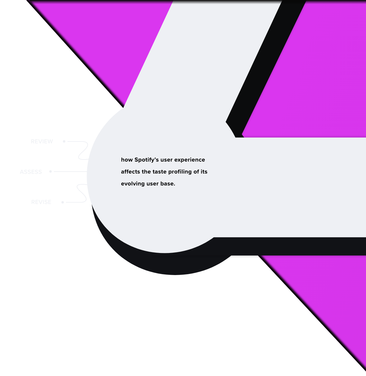
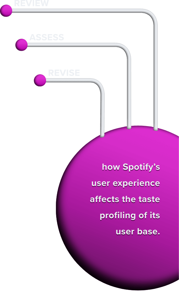
how Spotify’s user experience affects the taste profiling of its evolving user base.
How can we improve the accuracy of a user’s profile while enhancing their exploratory journey within the app?
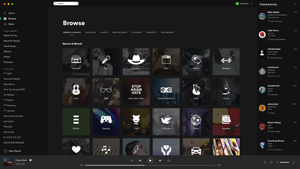
App Research
I started off by researching the mechanics of the current Spotify recommendation system (Bandits for Recommendations as Treatments) with a sole focus on how it categorizes its user base. Click on a research query to view my findings:
- What data is it collecting ?
 Implicit Feedback
- Total Track Streams
- Track Stream Length (streaming duration of a song)
- Session Length
- Downstream Activity (tracking what precedes a user interaction)
- Stream Saves (to library/playlists)
- Stream Shares
- Click-through Rates (artist page visits following a stream)
- Follows
- Listening Times (Day of week or time of day)
- Top Genres
- Top Tracks
- Top Artists
- Top Era
- Top City
- How is that data being used ?Collaborative Filtering
The system identifies patterns across the implicit and explicit feedback of its user base, categorizing these similarities into user archetypes (taste pattern profiles). These profiles are then used as a backdrop to generate inferred suggestions. A simple example of this would be when the system takes a track with a high approval rating among specific users and recommends the track to other users within the same archetypal bracket.
Historical Shifts:Spotify’s algorithm continuously updates user profiles by factoring in their current and previous consumption trends. Recent user activity and preferences are given more weight than historical averages. This increases the adaptive accuracy of each profile, allowing it to evolve alongside its respective user in real time.
Conjunctive RelationshipsUser data only accounts for half of the recommendation relationship. The Spotify BRT system also relies heavily on data extracted from the application’s hosted content (music or podcasts) to curate taste profiles. Artist-sourced meta-data, audio signals, lyrical analysis, user-generated playlists, and web-crawler data are a few examples of inputs that are interpreted into broader schemas to pair content with the application’s users.
- Are there opportunities to use that data better ?
Data gathered during the app research phase served as a launching pad for a few improvement ideas. It was evident that Spotify’s system was thorough in its collection of data, but I also knew that users themselves, had no direct access to any of these metrics. I started to hypothesize how self-referential access to the data inputs might impact a user’s experience in a positive or negative way.
Collaborative sorting
I began culling Spotify’s online Community forum and the Spotify Reddit thread for insights on what improvements their users were requesting and why. Most of these complaints could be sorted into three main categories:
Machine Learning that isn’t Learning
Users often purported that their Discover Weekly (a suggestion playlist) featured songs they’d previously listened to. Some users also reported feeling that the app’s recommendations looped them in an algorithmic circle over time. The overall sentiment behind these complaints was that Spotify’s suggestions were no longer broadening the exploratory gamut of their listening habits, but instead, perpetuating those that already existed.
Inadequate User Access to Listening History
Users don’t have access to primary referential data regarding how many times they’ve streamed songs in the past, if at all. The only way a user would know if they’d played a song previously is if they saved it to their library (by adding it to a playlist or the “Liked Songs” archive). Accordingly, even if a user properly utilized every saving feature within the app, there’s no way to filter a user’s library by favoritism (the number of times a user has played a song since first discovering it).
Limited Avenues for User Feedback
Users complained that suggestive features such as the Discover Weekly or Artist Radio channels didn’t provide a feedback outlet that could influence or validate the accuracy of said predictive tools.
Conclusion
These complaints delineated a flawed self-fulfillment pattern within machine learning, where applications base their suggestion on an assumed user preference without accounting for the confirmation bias of steering a user’s attention. These recursive and inadvertent false positives can gradually steer a user’s taste profile in the wrong direction over time.
Surveys & Interviews
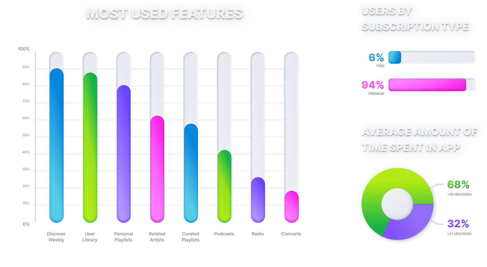
I ran a survey to gather further insights about Spotify’s user base. Participants included existing peers of mine, Reddit users, and Spotify community forum users. 6 out of 32 survey respondents also agreed to participate in a follow-up interview. The survey and interview questions asked users about the following:
- Amount of time spent in the app
- Most used features
- Device preferences
- Frustrations while using the app
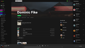
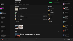
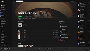
11 of the 32 respondents agreed to share their Spotify data with me either in the form of a direct download request or a yearly recap (both issued to the user by Spotify). This data was then analyzed and cross-referenced against self-purported estimates of the survey and interview results to generate the following user personas and preferences.
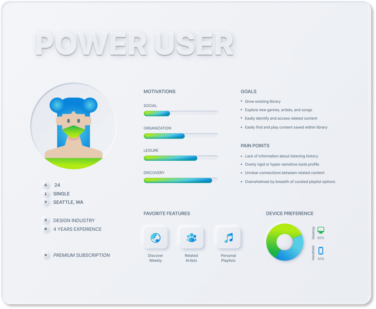
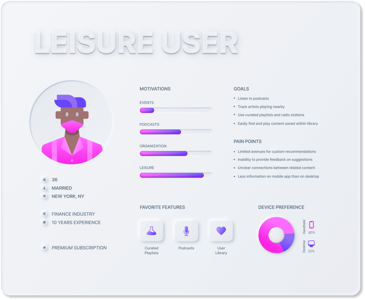
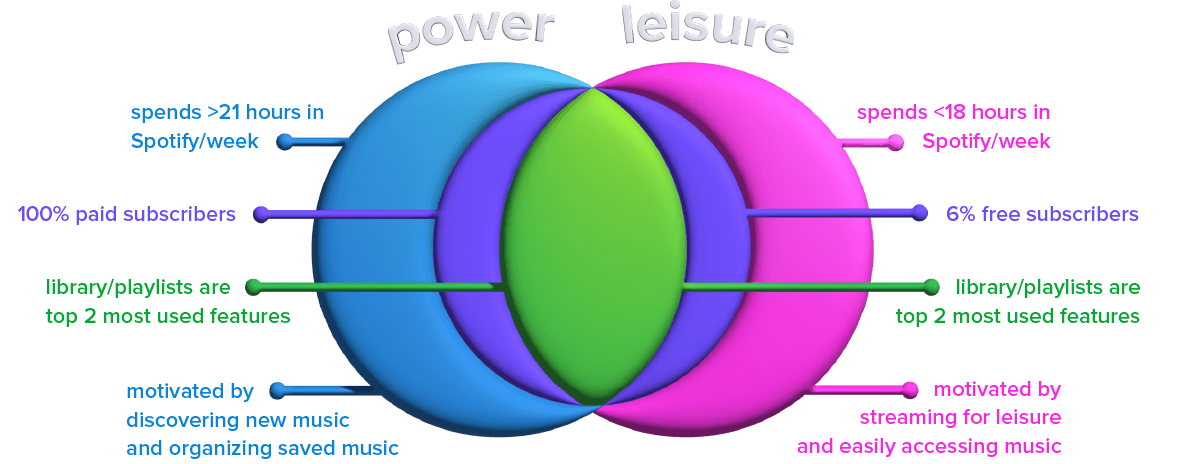
User Personas
A divergent pattern amongst user preferences and habits emerged. This division served as the basis for sorting users into primary and secondary personas of power and leisure users.
Design Strategy
I defined three end goals for a feature that would increase engagement among leisure users while alleviating power user complaints, then outlined three central components that would help the application meet those goals:
- 1
Accelerate the user’s ability to generate and steer their algorithmic recommendations
- 2
Leverage past and current user data collected from the start of a user’s profile
- 3
Provide interactive and visual insights about a user’s listening history, activity, and trends
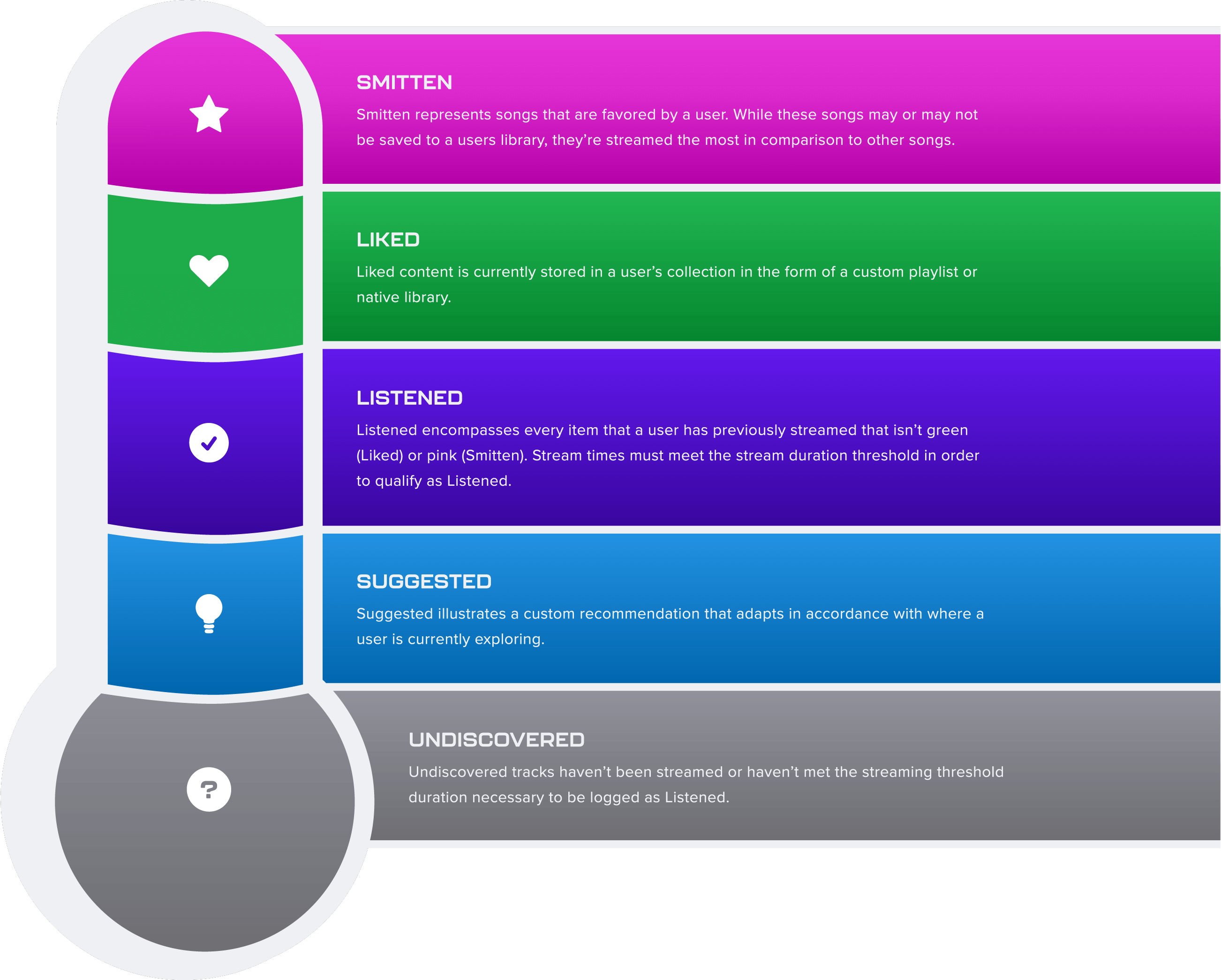
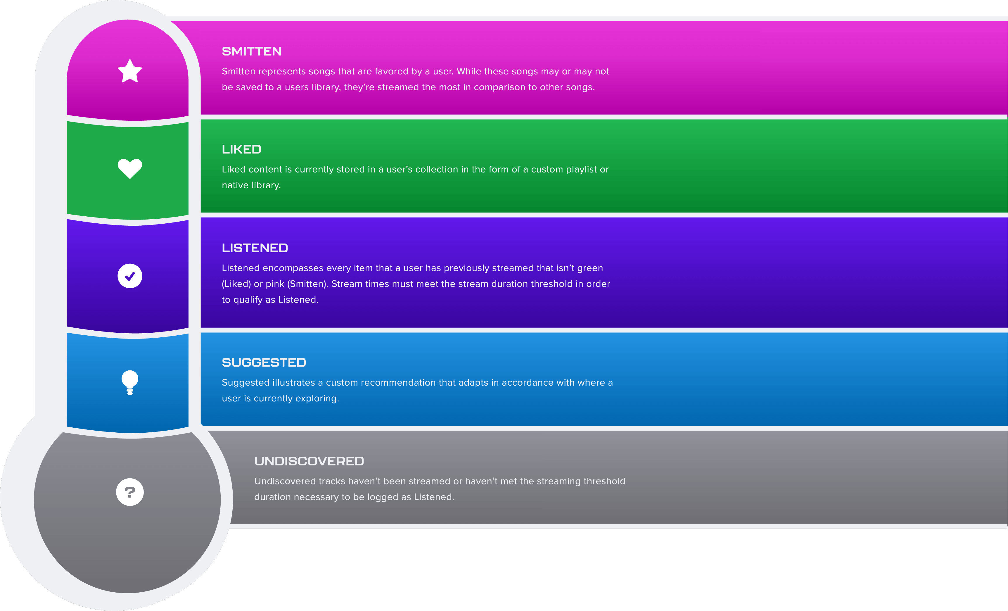
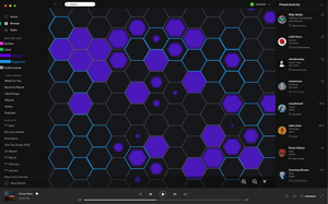
 Spectral affinity
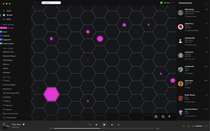
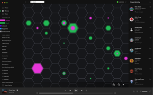
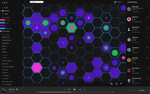
A heat grade system that typifies songs according to stream frequency and exposure
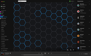
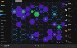
 Artist heatmap
A map that illustrates a user’s listening history and preferences for each artist
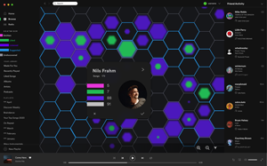
 Suggested Playlist
A generator that compiles suggested songs from the user’s map location
Visual Design
I created a color palette that visually communicates a song’s algorithmic relationship with the user. This colorized classification system is called Spectral Affinity, and it computes how many times a song has been streamed relative to when it was first found. I decided to call the toolset Heatmiser as an allusion to heat-seeking (infrared homing), where future favorite undiscovered tracks represent the “heat” that users are better equipped to find when using the toolset.
Prototyping
I recreated the existing Spotify interface with a wireframe of the heatmap, followed by a high-res prototype of each component. Keep scrolling to view demos of the high-res prototype below.
Spectral Affinity
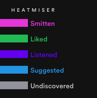
Spectral Affinity shading codifies a user’s proven or predictive affinity for a track. The effect applies globally across libraries, playlists, and artist pages and is only revealed when a user hovers over a song. The colorization communicates which songs have been favored, saved, previously played, or deemed a viable suggestion by the user’s taste profile.
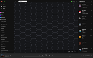
Heatmap
The Heatmap illustrates a user’s streaming biography with a compact and interactive data visualization. The map is made of hexagonal tiles, each of which provide a snapshot of a user’s listening history through Spectral Affinity shading. Individual Spectral Affinity grades can be turned on and off, offering a focalized view of specific insights.
Suggested playlist generator
Like Spotify’s Discover Weekly playlist, the Suggested Playlist tool generates recommendations from current and historical user data. The Heatmiser playlist is distinct however, in that it’s controlled on command by the user who can generate, refresh, and save infinite playlists from any visible area within the map.
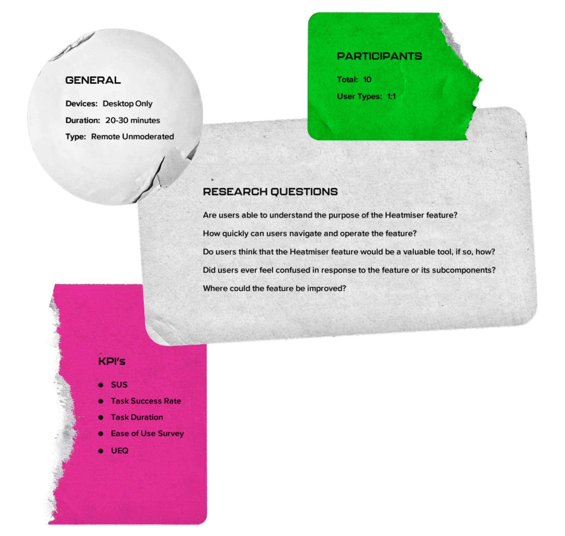
Remote Unmoderated Testing
Ten volunteers from the initial research phase agreed to participate as subjects in a round of remote unmoderated usability testing. Research questions revolved around the perceived value of the Heatmiser toolset, its usability, and potential areas for improvement.
An introductory user-type survey allowed me to sort each respondent’s data into primary or secondary archetypes for later comparison. Questions were interpolated throughout the task evaluation, which required subjects evaluate their experience using a specific feature. The assessment concluded with a System Usability Scale (SUS) survey, User Experience Questionnaire (UEQ), and Feature Desirability Survey
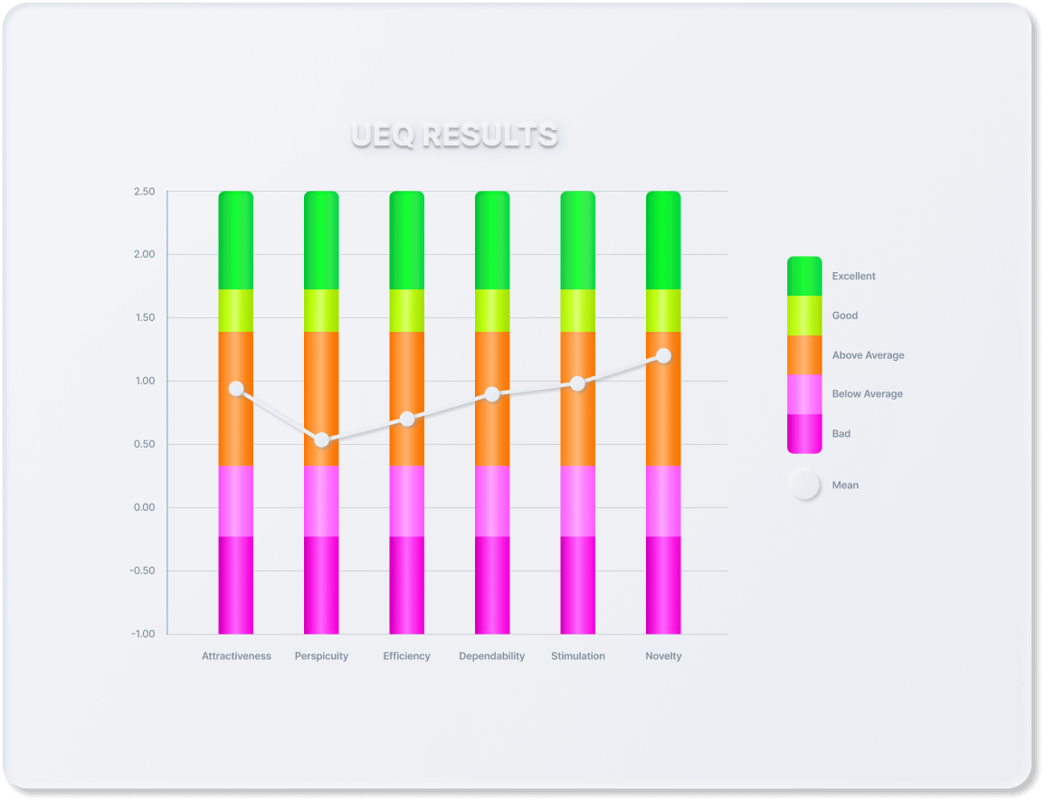
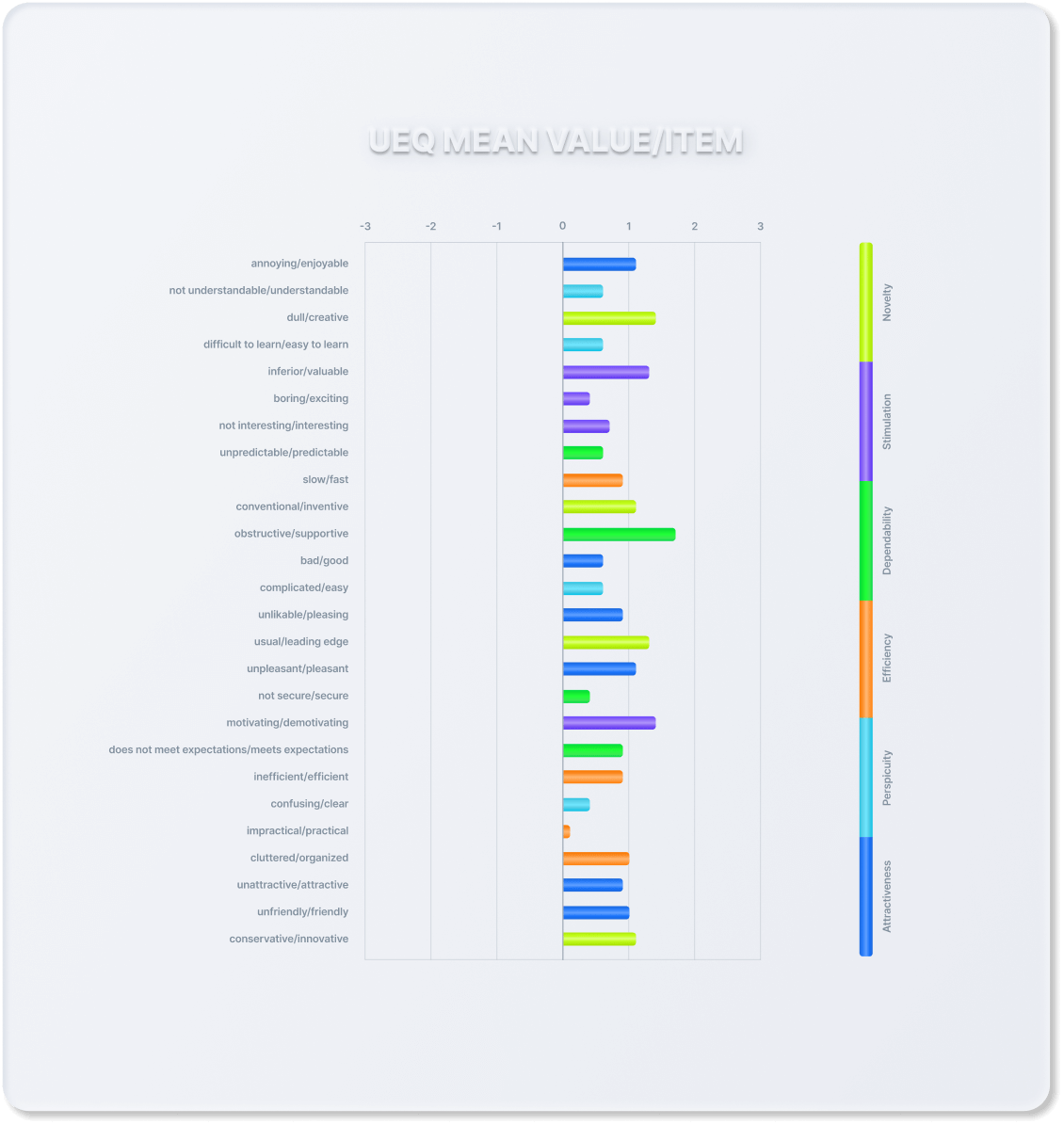
Results & Findings
KPIs were analyzed through the scope of total test subjects and primary versus secondary users. Most test subjects found the feature to be a valuable tool, with the highest UEQ results falling within Attractiveness, Novelty, and Efficiency. The toolset aggregated an average SUS score of 78.6.
Power users provided the most positive feedback overall, while both user types found the Suggested Playlist Generator to be the most valuable tool.
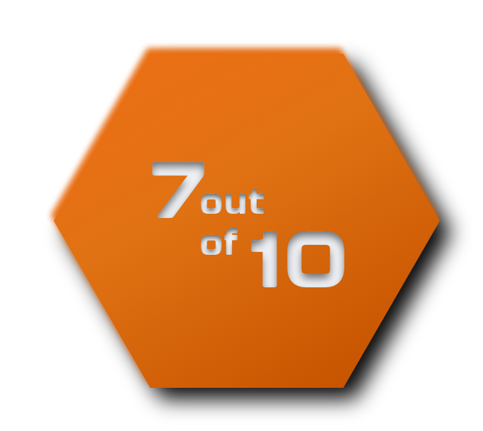
While 3 out of 5 Leisure users claimed they would consider using a desktop device to access the feature, the group also provided the weakest SUS ratings, which prepared the canvas for potential usability improvements.
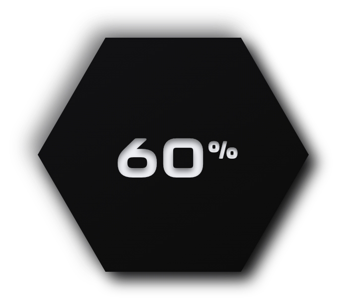
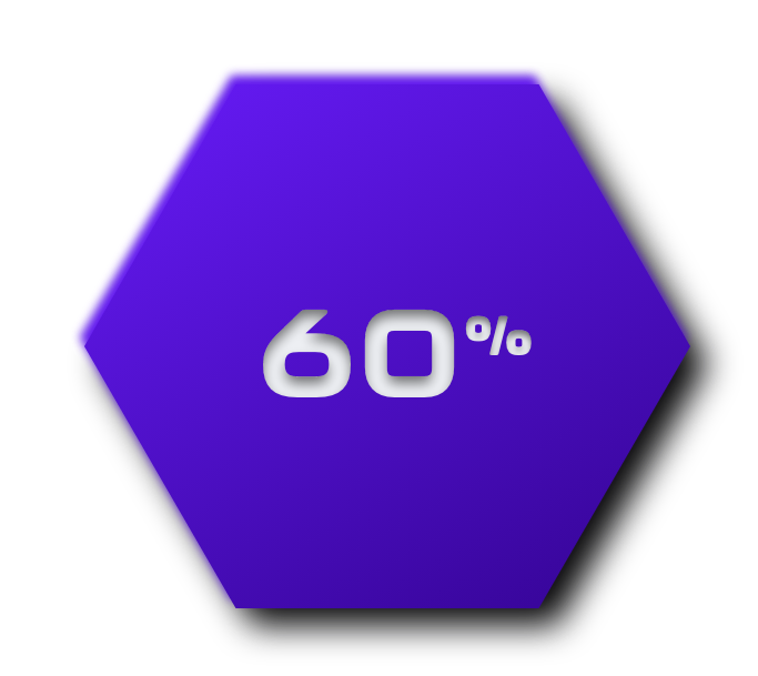
of leisure users said that they would consider using a desktop to access the Heatmiser toolset.
•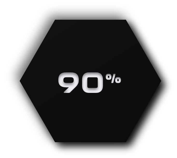
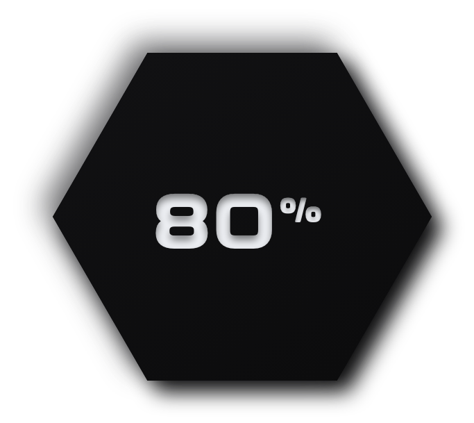
of power users found the Heatmiser feature to be a valuable tool
•

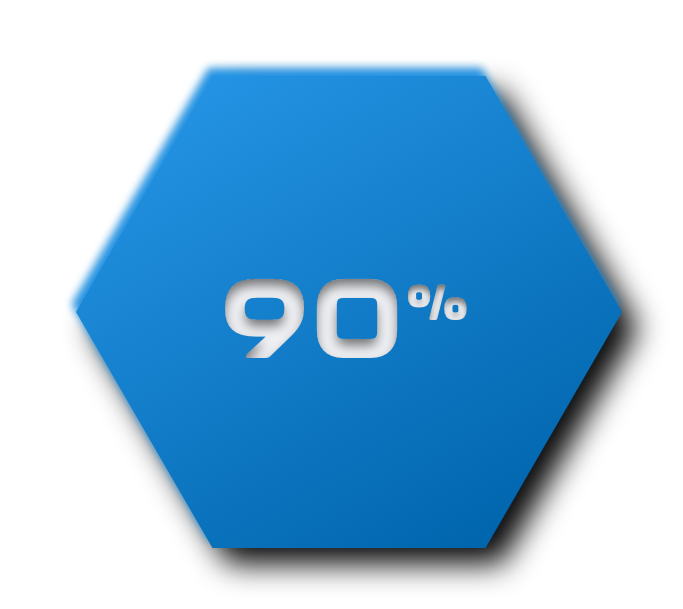
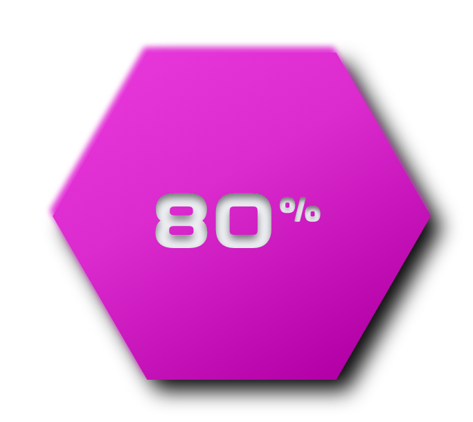
users felt that the Heatmiser feature could increase the accuracy of their taste profile through more intentional streaming activity
•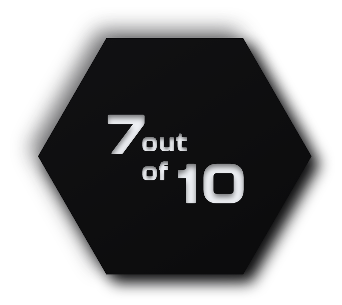
users favored the Suggested Playlist Generator over Spotify’s Discover Weekly
•
of users felt compelled to explore new music through Heatmiser tools as opposed to Spotify’s curated playlists
•Improvements
After reviewing the test, questionnaire, and survey results, I was able to identify several areas that correlated with weaker usability scores. The following revisions and fine-tuning sought to improve said regions.
Location tracking
Before

Roughly 40% of test subjects reported confusion over updating their location within the Heatmiser Map. The original location tracking function automatically updated a user’s map location to the current or most recently played artist’s tile. Users could then lock or unlock their location on the map. The former would freeze a user’s location to the most recently streamed artist and the latter would revert to the default tracking.
After

This logic didn’t allow users to manually set a new location. I revised this feature to give users total control over their location using a “set location” icon button found on each artist’s page. I set this new configuration as the default and moved the automatic location tracking option into a custom setting.
Low Contrast Text Color
Before
Some test subjects reported low legibility for the “Listened” (purple) Spectral Affinity grade label text (used to label each Spectral Affinity grade’s Heatmap toggle button). The original shade of purple for Listened had a poor contrast rating of 2.46 and failed to meet WCAG success criteria, where the minimum ratio for large text is 3.
After
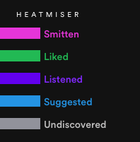
I created an additional lighter purple shade for the Listened label that yields a contrast rating of 3.31 and verified that the contrast ratios for the remaining Spectral Affinity grade labels met the minimum threshold.
Future Improvements
User testing should be completed on the revised prototype with remodeled survey questions that help elicit narrower insights with regard to potential sub-par usability ratings.
Location tracking could be further improved by adding an additional function where users could update their location through the artist tiles. This would reduce the number of steps necessary to complete the action, as users could remain within the Heatmap versus navigating to an artist’s page.
Adding a sort function to the Heatmap with categorical conditionals, such as genre, spectral affinity, and geographic location, could allow users to rearrange how artist tiles are situated and enhance their ability to generate unique findings.
Lastly, the toolset could also be improved by adding customization features, like turning the Spectral Affinity track highlight off/on, allowing users to set their own Spectral Affinity grade color scheme, or modifying the threshold for listened tracks to enable exploration sessions that don’t impact a user’s taste profile.