Diy
UX / Product Design
An interactive gallery, media database, and submission tool for an urban planning documentary about Hank Dittmar
Intro
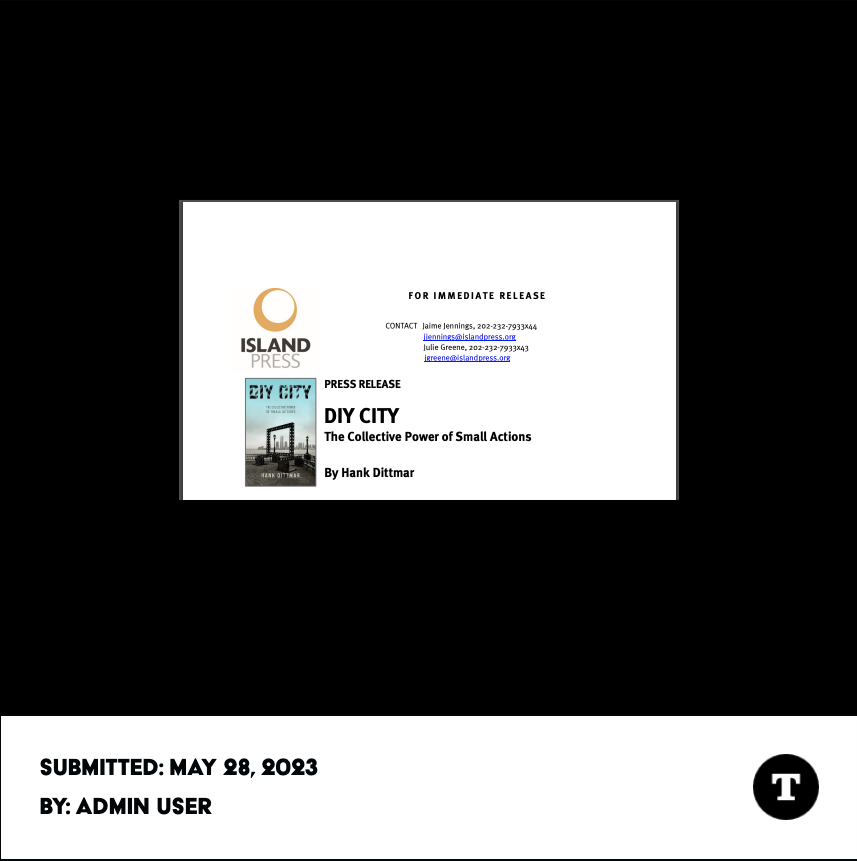
Hank Dittmar, a recognized figure in urban planning, renowned global urbanist, sustainability advocate, lyricist, author, and father, passed away on April 3rd, 2018. In commemoration of his impact, a group of Dittmar’s peers and family members (the DIY organization) set out to make an urban planning documentary cast through the lens of the late luminary’s life. I was asked to design a digital gallery for the project to store and showcase media submitted for inclusion in the final film.
Contributions
- UI Design (90%)
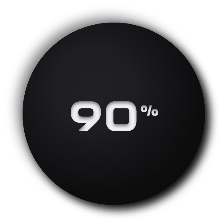
- UX Design (95%)
- UX Research (100%)
- Visual Design (100%)
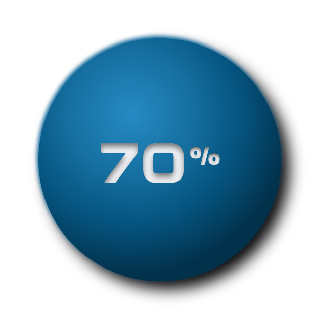
- Development (70%)
Tools
- HTML / CSS / React
- Figma / XD
- Adobe Suite
- Github / Jira
- VSCode
- Maze
Project Type
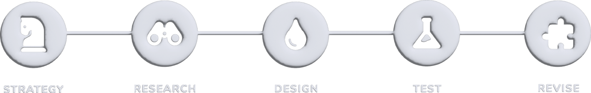
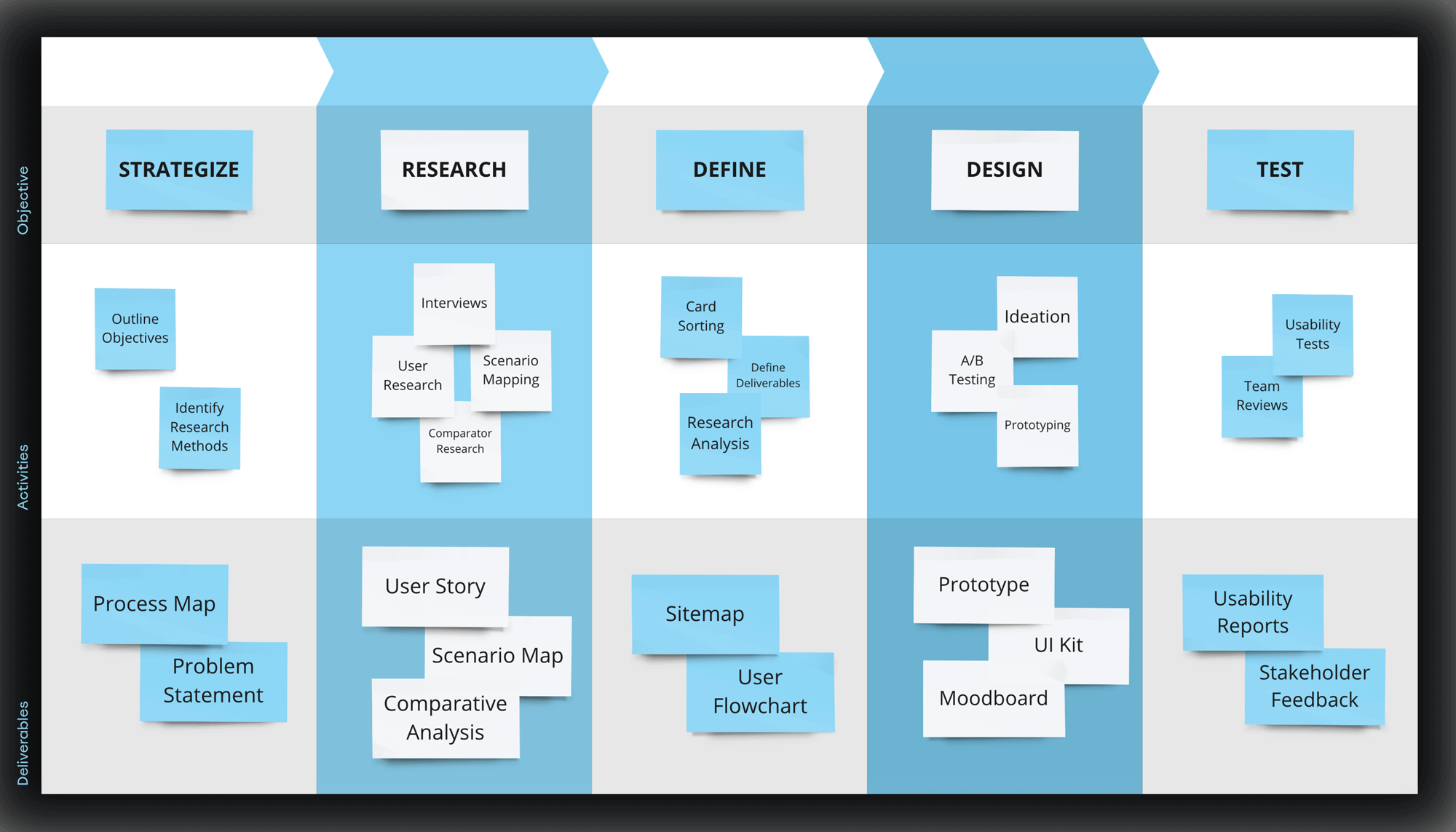
UX Process

One of the central goals of the DIY project is getting users to participate by submitting media to the gallery. The ease and speed with which users can understand the project’s intention and how to participate will determine how effectively they can garner submissions and meet said goal.
How can we clearly communicate the intention of the project and inspire visitors to contribute?
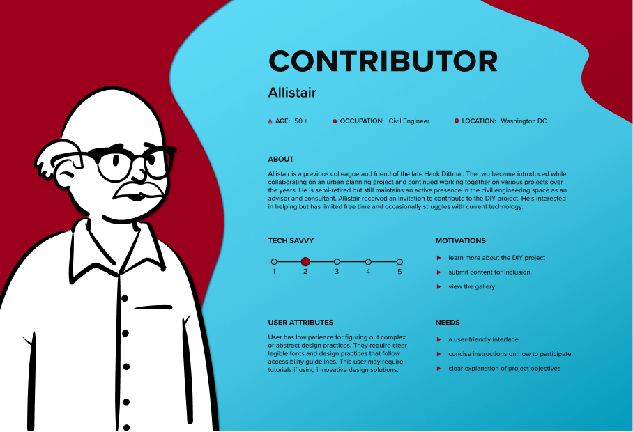
Stakeholder Interviews
After interviewing stakeholders and reviewing project requirements, I was able to outline some of the core features of the project. I organized these features into a hierarchy of primary versus descending components to help guide my research methods and paint a broader picture of what needed to be defined. This prioritization strategy assisted in later design stages, as it narrowed the scope of potential design solutions, which resulted in a more compact ideation and experimentation phase.
Hover over a feature to reveal its corresponding rank.
Tap a feature to reveal its corresponding rank.
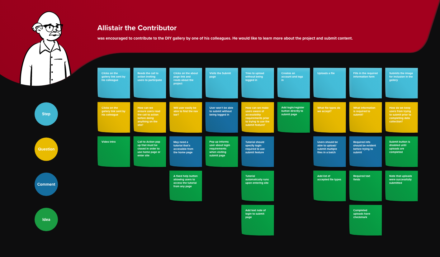
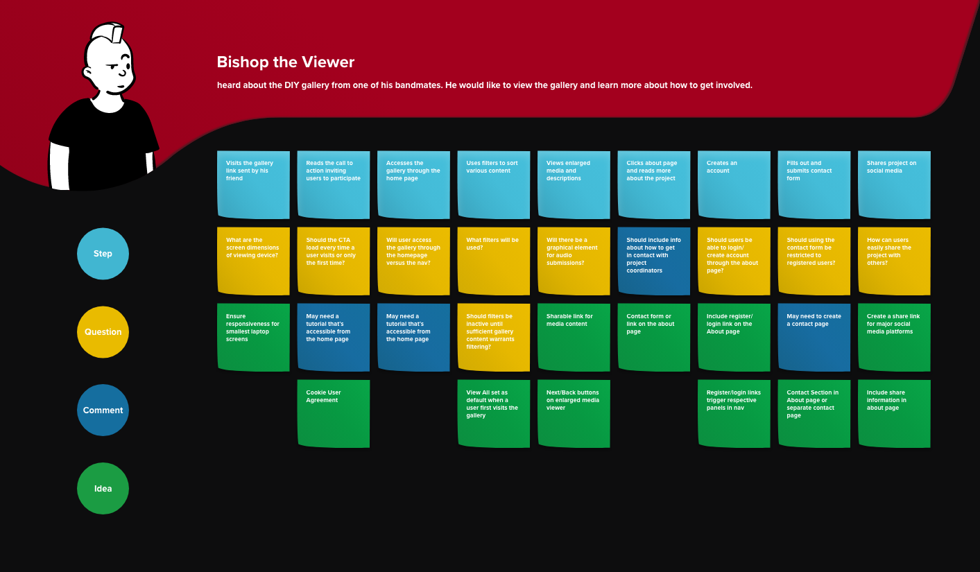
Scenario Mapping
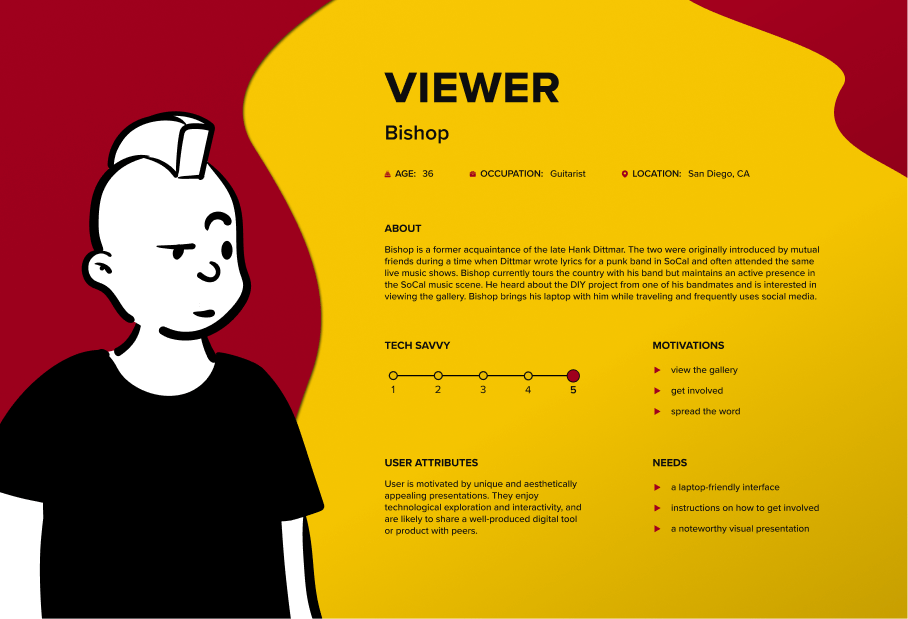
Information from stakeholder interviews allowed me to craft primary and secondary user personas and stories. That information was then used to conduct a scenario mapping workshop for primary and secondary tasks. The final scenario map added contextual breadth to the initial project requirements by outlining essential tasks, potential complications, and future design solutions.
Comparative Analysis
I conducted a comparative analysis to identify trends and opportunities for best design practices. Given the unique purpose of the DIY project, I chose to represent direct competitors with entities that used a similar online presence, either in the form of a digital gallery or a non-profit website, as they both require a clear statement of purpose to propagate user participation.
The analysis assessed each site’s ability to create a memorable visual presentation, effectively communicate the organization’s mission statement, and incite user interactivity. I recapitulated the assessment criteria into ten unique standards or practices. Using a 10-point scale, those comparators that scored a five or above were marked as exemplifying each respective standard or practice.
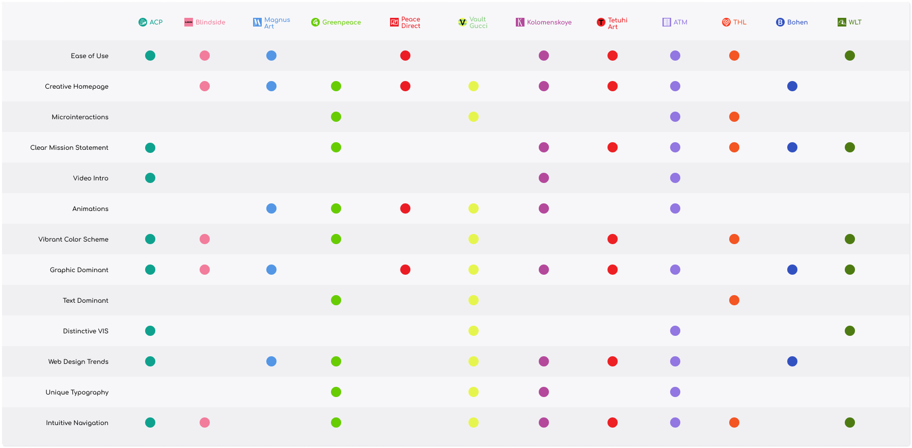
Observations & Opportunities
After reviewing the results of the analysis, I was able to extract four overarching similarities among comparators with the highest scores. The following findings were used as inspiration for best practices during later stages of the design and revision process.
Loud Color Palette
Microinteractions
Striking Typography
Trendy Web Design
Sitemaps & Userflows
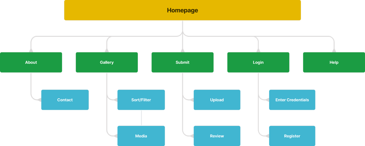
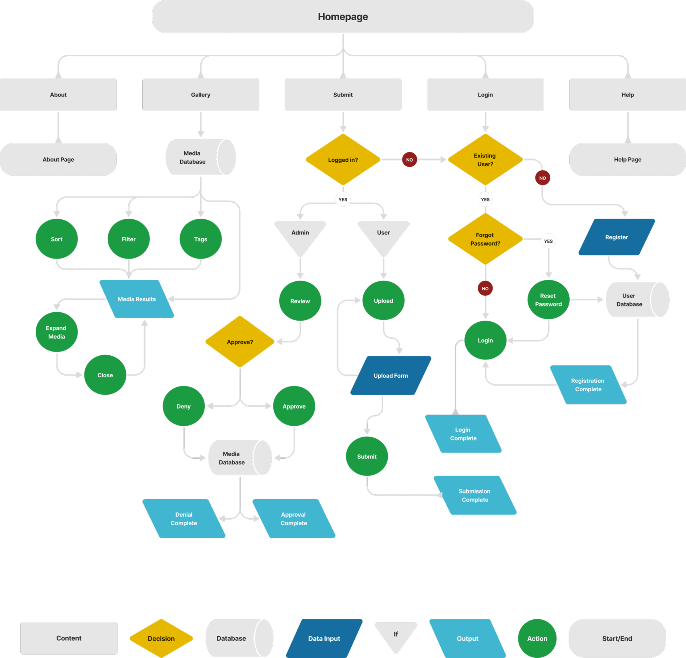
I created a sitemap that inventoried all the necessary project pages, followed by a user-flow chart that established the navigational and hierarchical layout of said pages. The user-flow chart underwent several rounds of stakeholder reviews and subsequent revisions before arriving at the final architecture.
Sitemap
Userflow
Moodboarding & Ideation
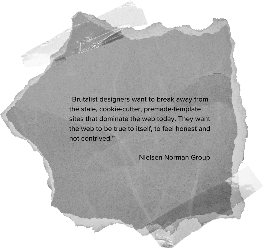
Visual exploration started with the creation of a mood board that coalesced media from two distinctive subject areas pertinent to Hank Dittmar's background: punk and urban planning. I analyzed the sentimentality and aesthetic of each motif before recognizing a point of convergence in brutalist design.
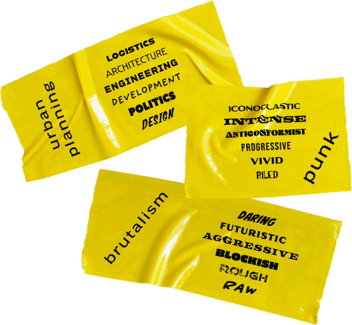
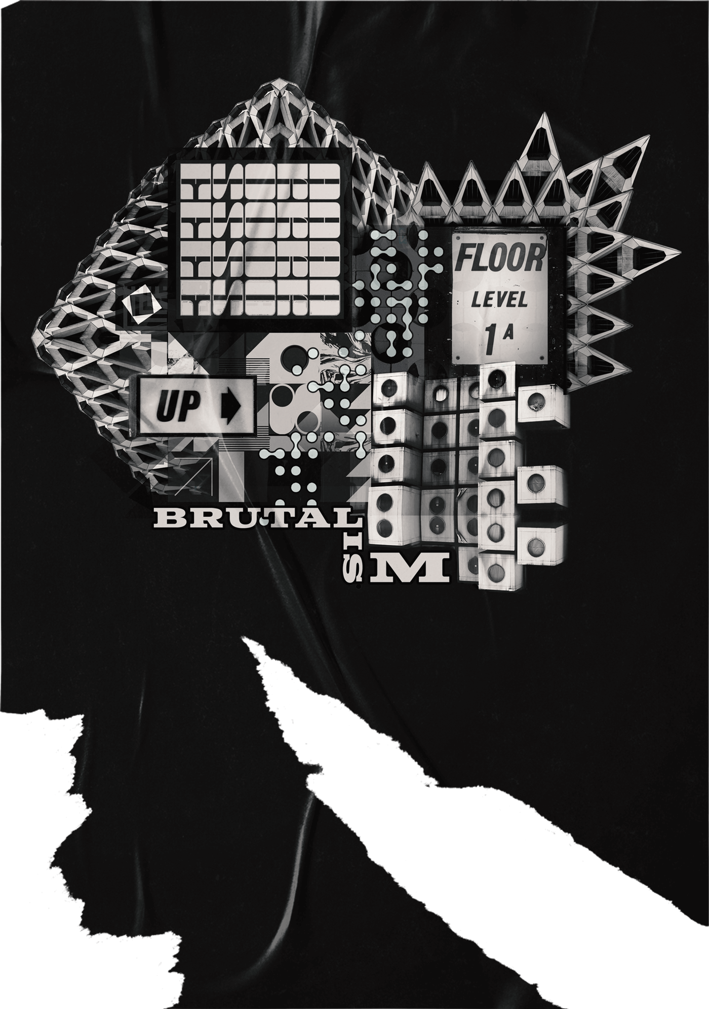
The brutalist style epitomized the architectural focus of urban planning with an assertive flare akin to that of the punk ethos. Brutalism established itself within the digital realm as a popular web design trend in the early 2000’s and made a recent resurgence in 2019. The signature black and white color scheme provided a suitable backdrop for loud pops of color. The geometric lineaments could effortlessly translate into a clean, minimalistic layout while creating an opportune canvas for striking typography.
Mockups & Prototyping
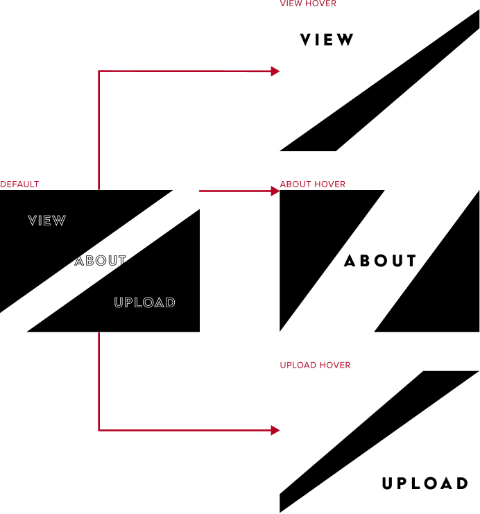
Design kicked off with exploration of different structural layouts for the home page. As the first thing users would see, the page needed to create a statement, rouse inquiry, and provoke exploration. I experimented with various fonts and oblique formations curated around an embedded navigational approach, wherein any click made by the user would redirect to a relevant page of the site and encourage interactivity.
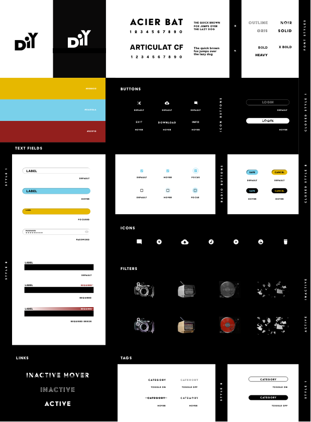
High Fidelity Mockups
High-fidelity mockups were produced for two design variants, each with distinctive gallery layouts but with a shared design for the Home and About sections. Criteria for the Submit page was still being defined at this time, so the section was excluded from the mockups until later stages.
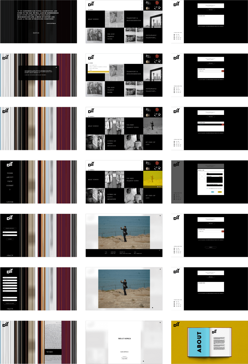
Prototyping
Design B was selected after both options were reviewed and compared using A/B testing. This design was preferred due to its higher ease of use ratings. Although Design B was less interactive than its counterpart (Design A), its comparative simplification better suited primary users who have lower patience for abstract design models. The high-res prototype and UI kit was then completed for Design B in preparation for the build phase.
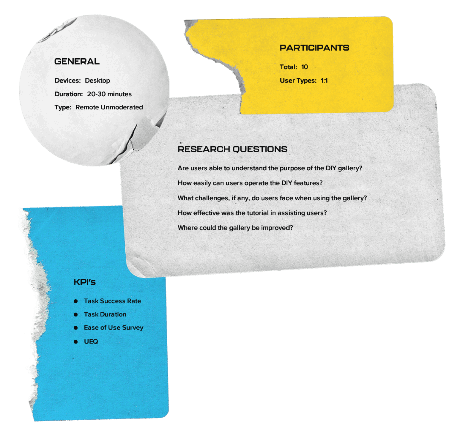
Remote Unmoderated Testing
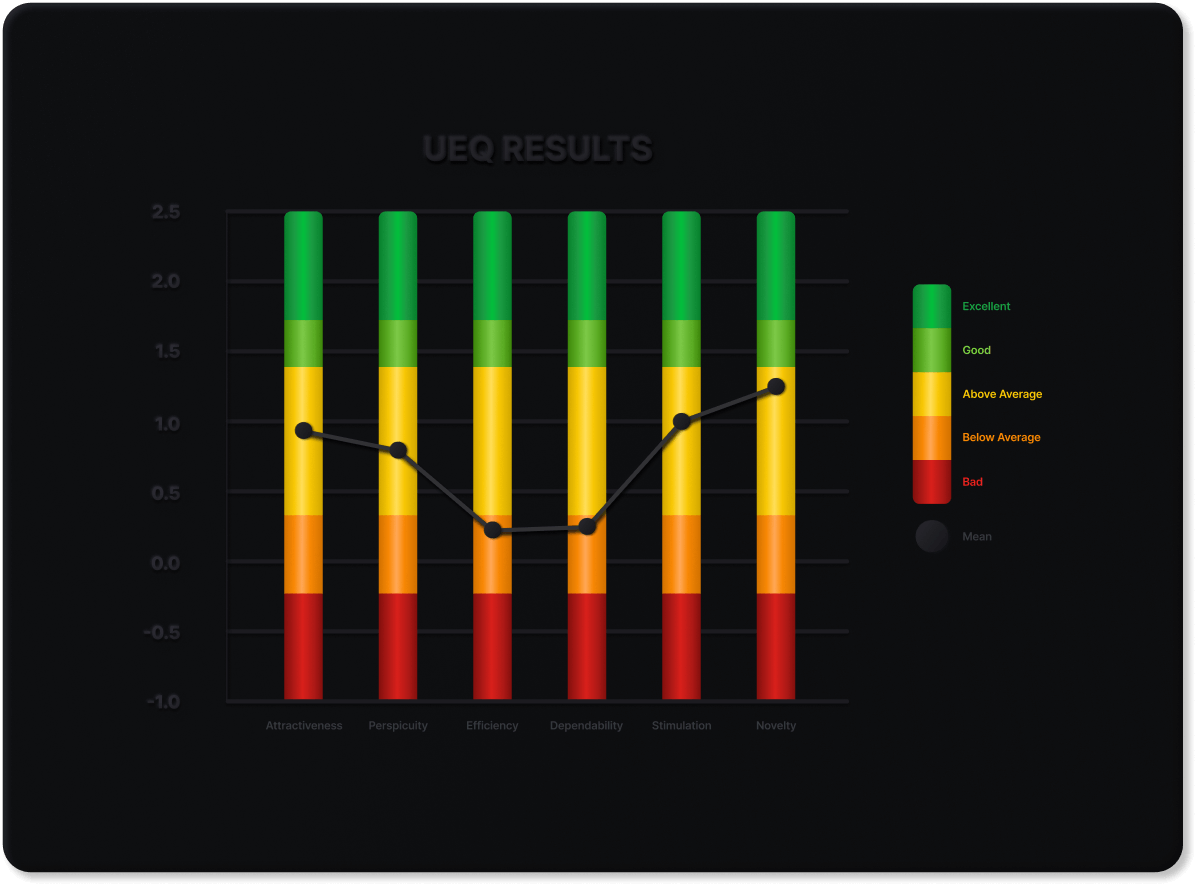
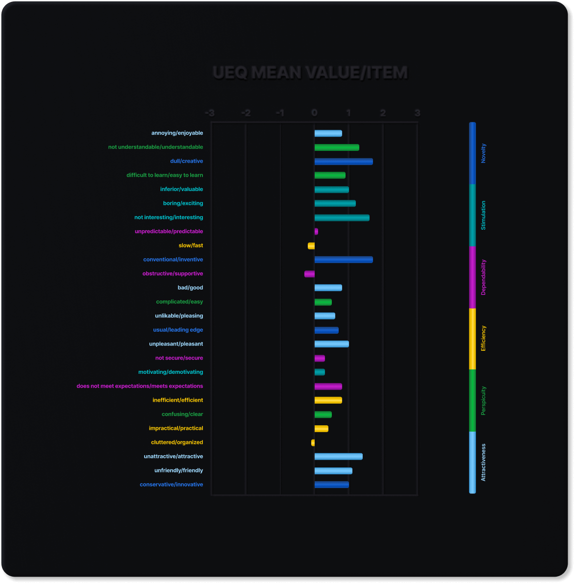
User testing was conducted with Maze and included a combination of opinion scales, multiple choice, and yes/no questions. User types were split 60/40 with 60% being secondary users (viewers) and 40% being primary (contributors). Testers were asked to complete 6 tasks and rate their experience by reporting the perceived difficulty. Task rating follow-ups required users that reported a neutral or negative rating to provide specific details about what made the task challenging and how any task-related features could be improved. The test concluded with subjects being asked to assess the entire scope of the application with a modified Ease of Use Survey and User Experience Questionnaire.
Results & Findings
100% of users were able to understand the purpose of the DIY gallery. The chief complaint among all users was that the application seemed unreliable due to poor video playback latency and media loading times. The second most common criticism was that the application seemed cluttered.
An equally popular, yet positive insight, was the purported novelty and stimulation of the application’s presentation, with the highest itemized UEQ ratings being creativity, inventiveness, interestingness, and attractiveness. The application’s text size and legibility garnered unanimous approval from primary users, while positive sentiments from secondary users largely congregated around satisfaction with the application’s overall appearance.
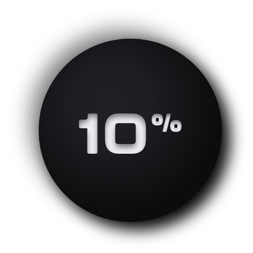
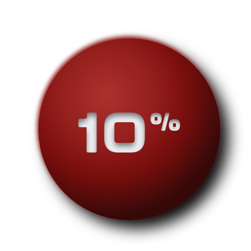
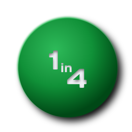
of below average usability ratings stemmed from the submit feature
•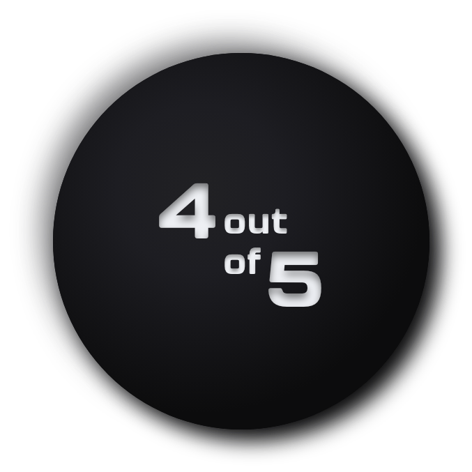
users understood the main functions and underlying objective of the application
•
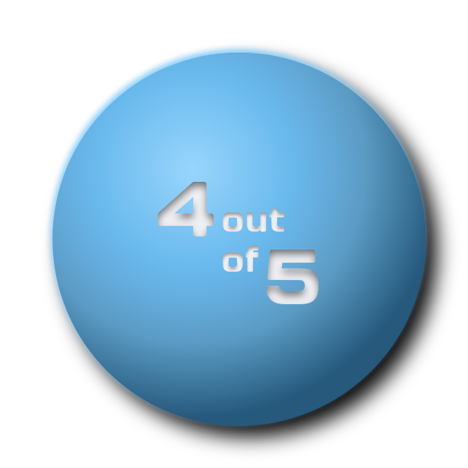
of users felt confident using the application without technical support
•
users found the application to be unnecessarily complex
•
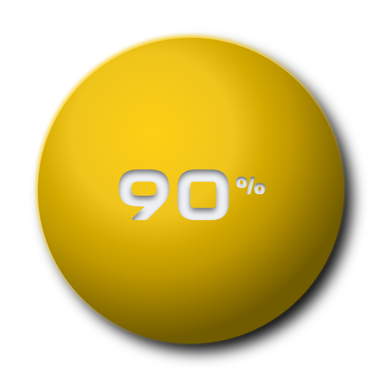
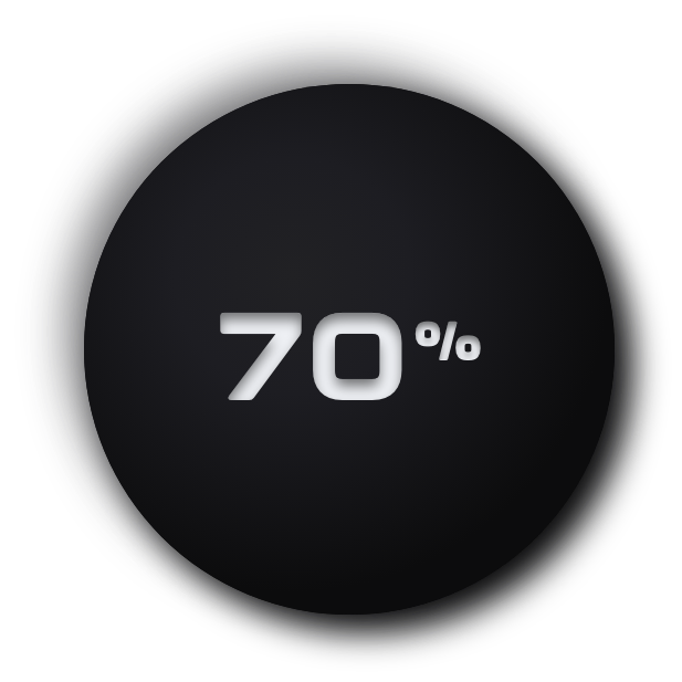
of users felt that the application’s functions were consistent and well-integrated
•Improvements
Several sub-standard usability ratings converged around difficulty using the media gallery’s adjunct features (sort and filter). Most of the users that reported confusion over these features didn’t review or access the application’s tutorial during their test session. This factor was considered during the first round of improvements, where we chose to focus our efforts on features that offered clearer feedback.
The lowest task assessment ratings from Secondary users centered around the upload component. This component was used to submit content for inclusion in the gallery and required multiple sub-steps. Users struggled to deduce which steps remained during the task process.
Gallery Categories
Before
The original gallery sorted media using five content categories: Work, Art & Creativity, Urban Planning, Family & Friends, and General Recollections. Each homepage column represented a category that allowed users to automatically visit a given section by clicking on its respective slideshow. Users could narrow down media results within each gallery category using a set of unique tags.
After
Stakeholders requested that these categories and tags be removed and only added back once sufficient media submissions had accumulated to warrant their use. We updated the design by eliminating the homepage slideshow title banners and replacing the category drop-down menu with a standard sort menu that allows users to arrange results by media type or portrayed date.
SUBMISSION LOADING BAR
We installed a loading bar on the submit page that appears when a user submits batch submissions or media with large file sizes, where the heavier data transfer elongates processing time. The loading bar illustrates that the transmission is still in progress and reduces the probability of a user misinterpreting the delayed confirmation status as the application freezing.
TEXT ITEM PREVIEWS
Before
After
The original Review page auto-populated the titles of each text and audio media item as the focal point for the tile’s default and hover state. We changed the hover state of text media tiles within the Review page to include a graphical preview of the featured text document. This update created a visual distinction between text and audio items which otherwise look quite similar. We applied the same update to the Gallery page for consistency.
SUBMIT PAGE INSTRUCTIONS
We modified the note that instructs users to fill out the form that accompanies each uploaded media item (a pre-requisite to submitting). The styling was adjusted to have a higher contrast and only appear during applicable stages (when an item has an incomplete media form). This modification supports a more gradual task flow, where presenting the instructions in incremental steps gently guides the user and reduces the potential for confusion.
REVERT/EDIT/DELETE MEDIA ITEMS
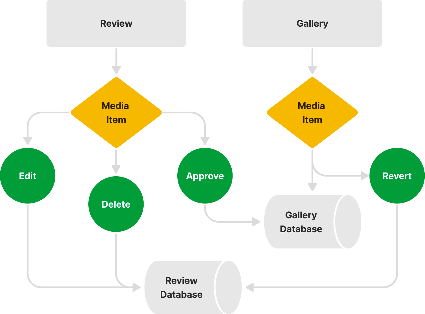
The original blueprint for the Gallery and Review pages didn't provide an option for deleting media, editing metadata after review approval, or removing media from the gallery without accessing the backend. We added an access-controlled delete button to media items within the Review page and a revert button to media items within the Gallery page, to accommodate those functions. These updates allow admins to move media items back and forth between the Gallery and Review sections where they can be edited or deleted as needed.
FUTURE IMPROVEMENTS
The revised product should be tested with stakeholders and a new batch of users to assess the impact of the cited improvements and detect any lingering sub-par usability ratings. Usability tests should also be updated to require that subjects review the tutorial prior to beginning assigned tasks. This adjustment would clarify the origin of poor ratings associated with media gallery features from the first round of testing.
A tutorial shortcut button should be added to the lower right-hand corner of every page. This button would grant users one-click access instead of the two steps currently necessary from its location within the main menu. Additionally, the tutorial would be more intuitive if it was programmed to automatically load content related to the page the user is on.
Utilizing a CDN and other streaming optimization tools and practices would improve video playback. Current data-handling is insufficient for supporting smooth previews of larger video files, which are expected submissions once the project is live.